
Custom Charts with Flat Data
The following step-by-step instructions can help you build a custom chart that expects flat data.
Use case
Build a custom heatmap chart to understand which organization and search type combinations generate the most query load.
Before you begin
To build a custom chart, you need to bridge two things:
- What data you already have: This is the structure of your ingested data, which is usually flat.
- What the chart expects: Each chart type needs data in a specific format. Some charts expect flat data, while others require nested data.
Note: Understanding both is important because it helps you write the right SQL query, prepare the data through grouping or aggregation, reshape the results to match the chart’s structure, and map them correctly in the JavaScript code that renders the chart.
Step 1: Understand the ingested dataset
In OpenObserve, the data ingested into a stream is typically in a flat structure.
Example: In the following dataset, each row represents a single event or query log with its own timestamp, organization ID, search type, and query duration.
  { "_timestamp": "2025-05-12T09:00:00Z", "organization_id": "test", "search_type": "logs", "query_duration": "10h 51m 13s" },
  { "_timestamp": "2025-05-12T09:01:00Z", "organization_id": "production", "search_type": "alerts", "query_duration": "11h 46m 00s" },
  { "_timestamp": "2025-05-12T09:02:00Z", "organization_id": "test", "search_type": "alerts", "query_duration": "7h 44m 21s" },
  { "_timestamp": "2025-05-12T09:00:00Z", "organization_id": "test", "search_type": "logs", "query_duration": "0h 58m 02s" },
  { "_timestamp": "2025-05-12T09:02:00Z", "organization_id": "production", "search_type": "logs", "query_duration": "11h 24m 37s" },
  { "_timestamp": "2025-05-12T09:00:00Z", "organization_id": "production", "search_type": "alerts", "query_duration": "8h 25m 29s" },
  { "_timestamp": "2025-05-12T09:01:00Z", "organization_id": "production", "search_type": "alerts", "query_duration": "2h 30m 01s" },
  { "_timestamp": "2025-05-12T09:00:00Z", "organization_id": "production", "search_type": "alerts", "query_duration": "4h 10m 21s" },
  { "_timestamp": "2025-05-12T09:02:00Z", "organization_id": "production", "search_type": "logs", "query_duration": "4h 40m 34s" },
{ "_timestamp": "2025-05-12T09:01:00Z", "organization_id": "test", "search_type": "dashboards", "query_duration": "3h 33m 28s" }Note: Use the Logs page to view the data ingested to the stream.
Step 2: Identify the expected data structure
Before moving ahead, identify what structure the chart expects. The heatmap chart expects flat data.
In this example, each row in data[0] must contain:
organization_id(example: "test")search_type(example: "logs")- A numeric value (
total_seconds) representing total query time.
Note: For charts that expect flat data, reshaping is not needed. SQL alone is enough to prepare the data in required format.
Step 3: Prepare the data (via SQL)
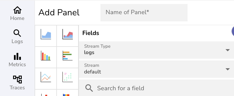
In the Add Panel page, under Fields, select the desired stream type and stream name.
Build a SQL query in the Query Editor to fetch and prepare the data:
- Converting
query_duration(text) into numeric seconds - Grouping by
organization_idandsearch_type - Summing the durations to get a meaningful value per cell in the heatmap
  SELECT
  organization_id,
  search_type,
  SUM(
    split_part(query_duration, 'h', 1)::int * 3600 +
    split_part(split_part(query_duration, 'h ', 2), 'm', 1)::int * 60 +
    split_part(split_part(query_duration, 'm ', 2), 's', 1)::int
  ) AS total_seconds
FROM
  default
WHERE
  query_duration IS NOT NULL
GROUP BY
  organization_id, search_type
ORDER BY
  organization_id, search_type;
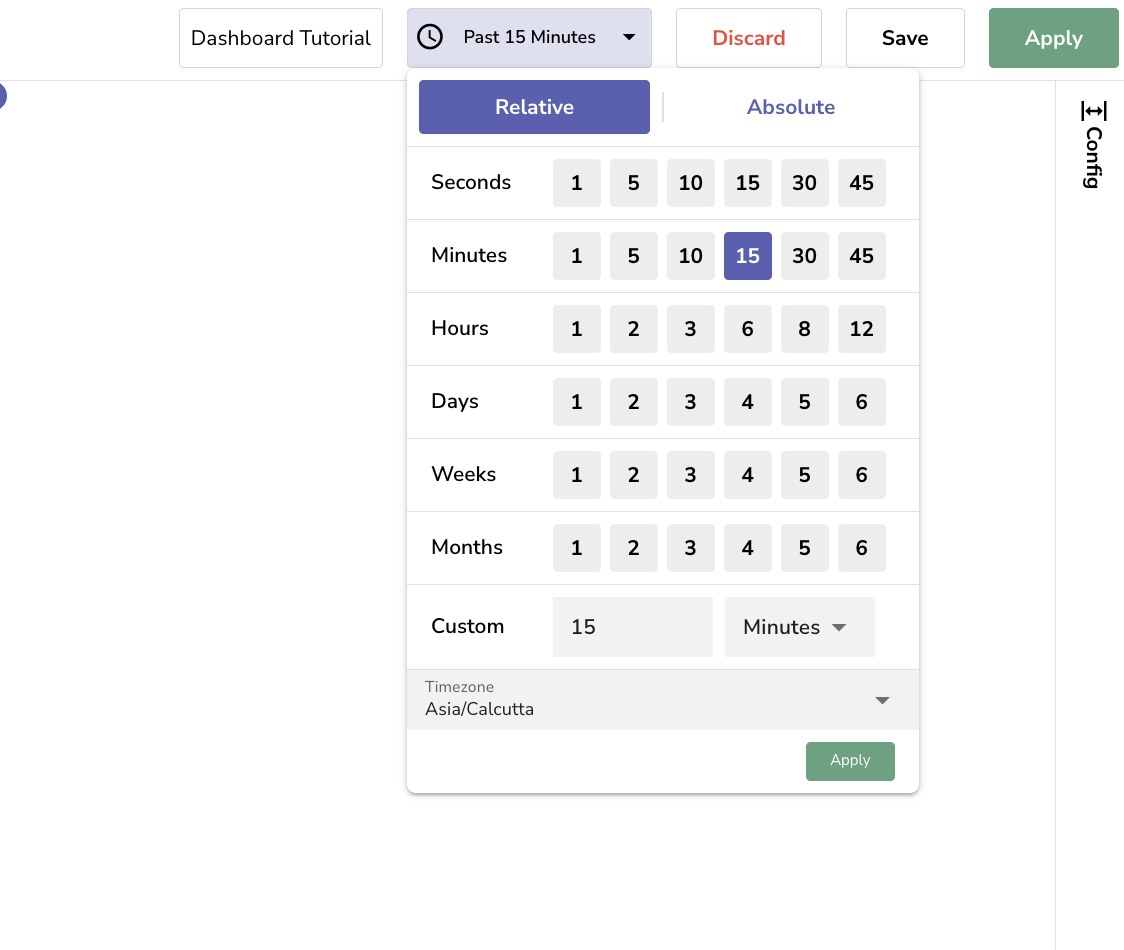
Select a time range to fetch the relevant dataset for your chart.
Expected query result
data=[[
  { "organization_id": "production", "search_type": "alerts", "total_seconds": 96711 },
  { "organization_id": "production", "search_type": "logs", "total_seconds": 57911 },
  { "organization_id": "test", "search_type": "alerts", "total_seconds": 27861 },
  { "organization_id": "test", "search_type": "dashboards", "total_seconds": 12808 },
  { "organization_id": "test", "search_type": "logs", "total_seconds": 42555 }
]]Note: OpenObserve stores the result of the query in the data object as an array of an array.
Step 4: Inspect the queried dataset
Inspect the queried dataset:
console.log(data);
console.log(data[0]);
Step 5: JavaScript code to render the heatmap
In the JavaScript editor, you must construct an object named option.
This option object defines how the chart looks and behaves. To feed data into the chart, use the query result stored in data[0]
The following script:
- Extracts all unique orgs and search types
- Creates a [x, y, value] format for each cell
- Configures a color gradient using visualMap
const orgs = [...new Set(data[0].map(row => row.organization_id))];
const types = [...new Set(data[0].map(row => row.search_type))];

const heatData = [];
orgs.forEach((org, y) => {
  types.forEach((type, x) => {
    const match = data[0].find(row => row.organization_id === org && row.search_type === type);
    heatData.push([x, y, match ? match.total_seconds : 0]);
  });
});

option = {
  title: { text: 'Query Load Heatmap' },
  tooltip: {
    position: 'top',
    formatter: function (params) {
      return `${orgs[params.value[1]]} → ${types[params.value[0]]}: ${params.value[2]} seconds`;
    }
  },
  grid: { height: '50%', top: '10%' },
  xAxis: { type: 'category', data: types, splitArea: { show: true } },
  yAxis: { type: 'category', data: orgs, splitArea: { show: true } },
  visualMap: {
    min: 0,
    max: Math.max(...heatData.map(d => d[2])),
    calculable: true,
    orient: 'horizontal',
    left: 'center',
    bottom: '5%'
  },
  series: [{
    name: 'Query Duration (s)',
    type: 'heatmap',
    data: heatData,
    label: { show: true },
    emphasis: {
      itemStyle: {
        shadowBlur: 10,
        shadowColor: 'rgba(0,0,0,0.5)'
      }
    }
  }]
};
Step 6: View result
Click Apply to generate the chart.
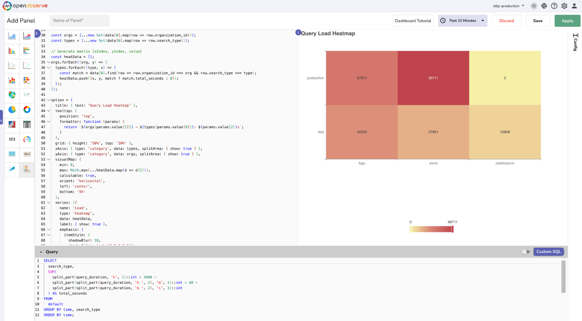
Understand the chart
In the chart,
- The
x-axisshows search_type (logs, alerts, dashboards). - The
y-axisshowsorganization_id(test, production). - Each cell color reflects total query time.
Use this heatmap to quickly spot load-heavy combinations like production → alerts, where optimization or alert review may be needed.
Troubleshoot
Use the following guidance to identify and fix common issues when working with custom charts:
1. No data found
Cause: The SQL query did not return any results.
Fix:
- Confirm the selected time range includes data.
- Check that the stream name and field names are correct.
- Run the query in the Logs view to verify that results are returned.
2. Uncaught ReferenceError: option is not defined
Cause: The chart configuration was not defined correctly.
Fix:
- Ensure
option = {...}is defined at the end of your JavaScript. - Do not rename the option variable or wrap it in a function or condition.
3. Unsafe code detected: Invalid JavaScript syntax.
Cause: There is a syntax error in your JavaScript.
Fix:
- Check for missing or extra commas, brackets, or quotation marks.
- Open your browser's developer console to locate the error.
- Use
console.log()to test your script step by step.
4. Chart not rendering:
Cause: The query returned data, but the chart did not render.
Fix:
- Use
console.log(data[0])to confirm that the dataset is not empty. - Make sure the field names in your script match the query output.
Last updated on
What Are Custom Charts
Create custom charts in OpenObserve using SQL and JavaScript for full control over advanced visualizations tailored to your data structure.
Custom Charts with Nested Data
Build a custom Sunburst chart in OpenObserve using nested data. Learn how to transform flat query logs into hierarchical visual insights.