
Trellis Layout
This guide explains how to use the Trellis Layout option under the Config tab to split a single chart into multiple consistently formatted panels based on a selected breakdown field.
What is Trellis Layout?
Trellis Layout creates a separate chart panel for each unique value in a selected breakdown field. All panels use the same X-axis and Y-axis scales, making it easier to visually compare metric trends across different values.
For example, if the breakdown field is k8s_app_instance, Trellis Layout generates one panel for each application instance.
Supported Chart Types
Trellis Layout supports:
- Area
- Bar
- Horizontal bar
- Line
- Scatter
Apply Trellis Layout to a Panel
Follow these steps:
-
Open or create a panel.
-
Click Add Panel to create a new panel and choose a supported chart type. Alternatively, select Edit Panel from the dropdown menu on an existing panel.
-
Under Fields, choose a stream type and a stream name.
-
By default, the system set the X-axis as
histogram(_timestamp). Modify if needed. -
Under Fields, select Y-axis and Breakdown.
- To select a Y-axis field, hover over a field and click the +Y icon.
For example,
k8s_container_name.
Note: You can select more than one Y-axis fields.
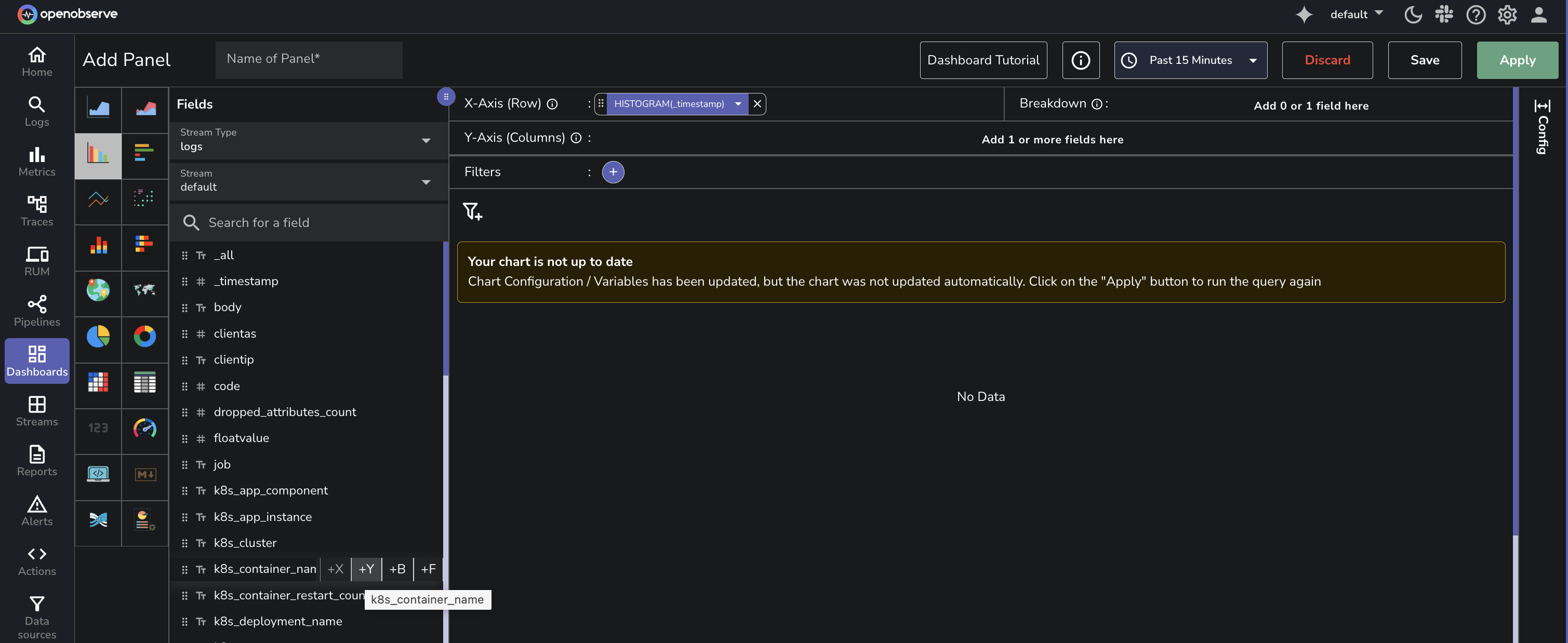
- To select a Breakdown field, hover over a field and click the +B icon.
Choose a groupable field. For example,
k8s_app_instance.
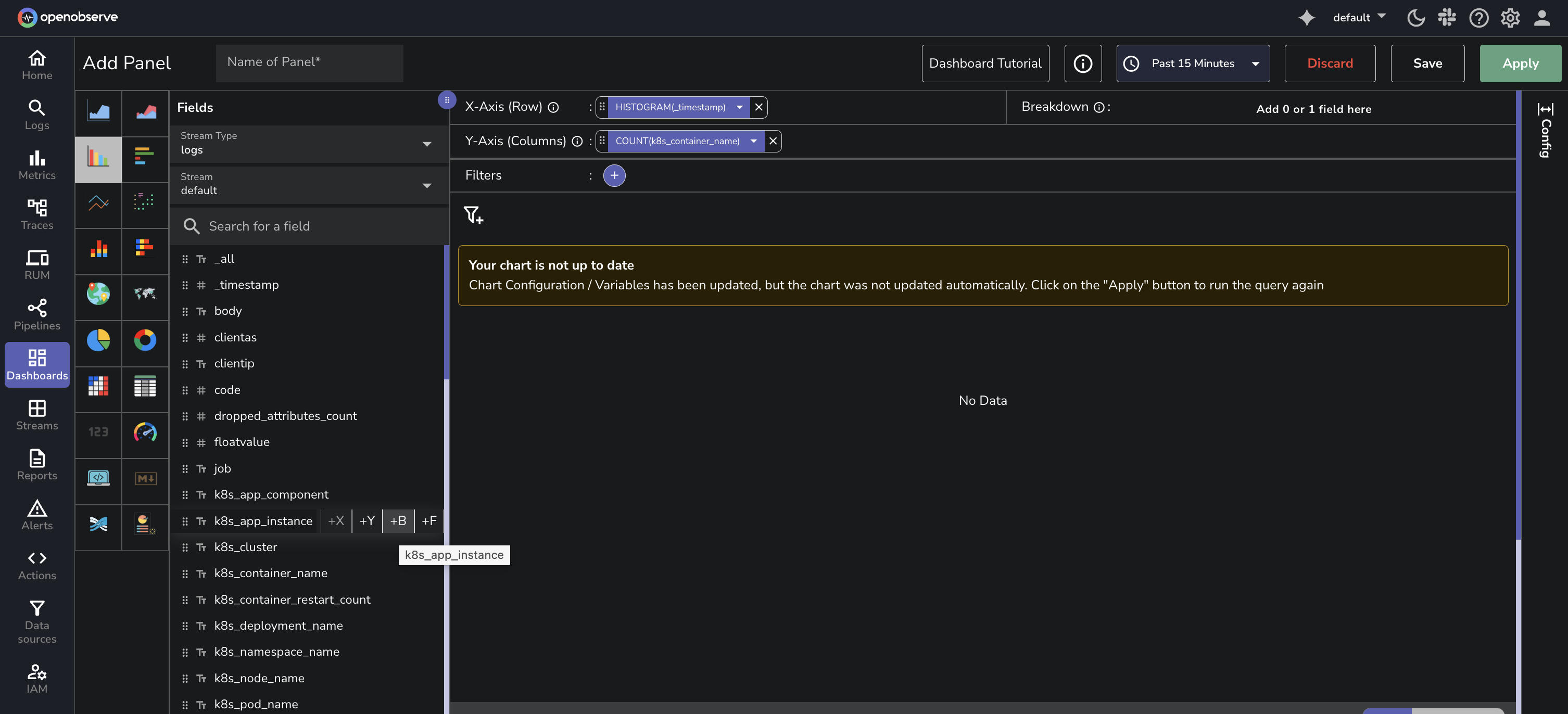 This enables the Trellis Layout configuration options in the Config tab.
 - To select a Y-axis field, hover over a field and click the +Y icon.
For example,
-
Click the Config tab, to configure Trellis Layout.
-
Under Trellis Layout, choose how panels should be arranged:
- None: No panel splitting
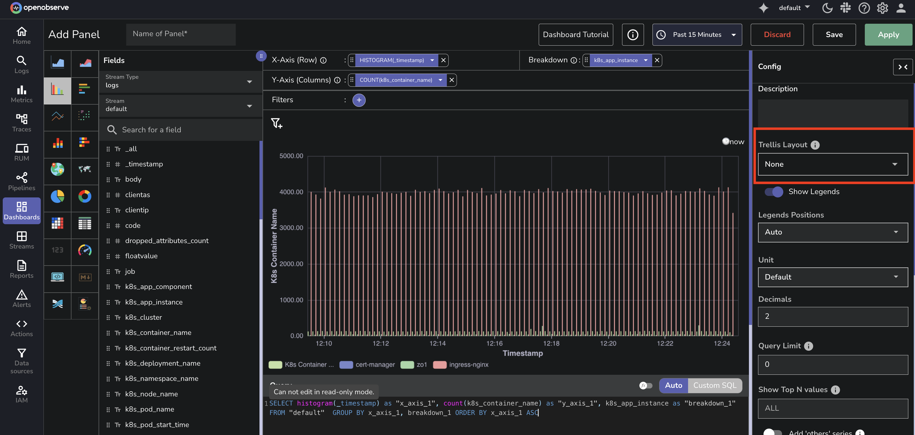
- Auto: Automatically arranges the layout
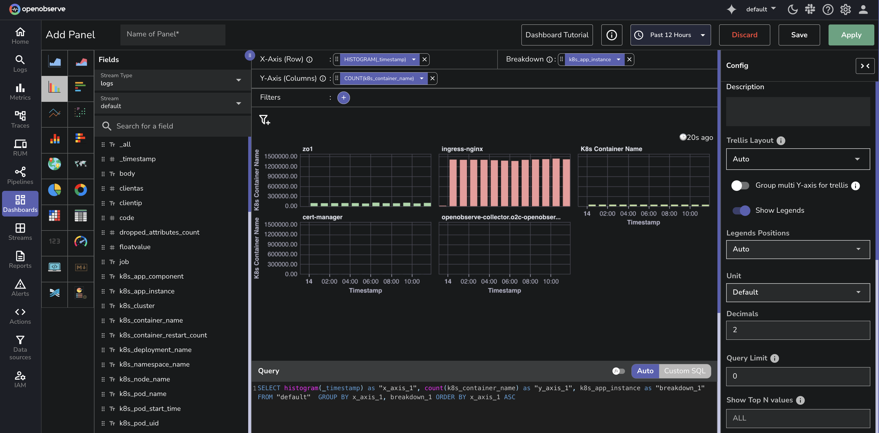
- Vertical: Stacks panels vertically
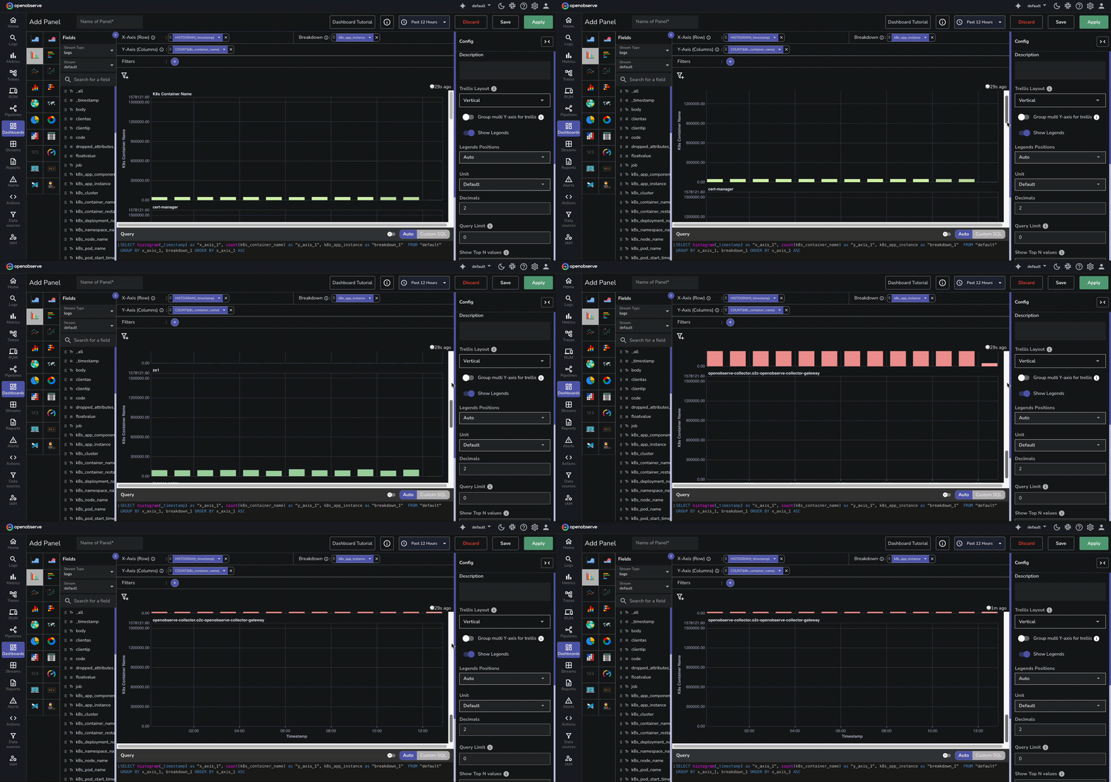
- Custom: Allows you to specify the number of panels per row
- None: No panel splitting
-
If you choose Custom, enter a number in the Columns Per Row field to control how many charts appear in each row.
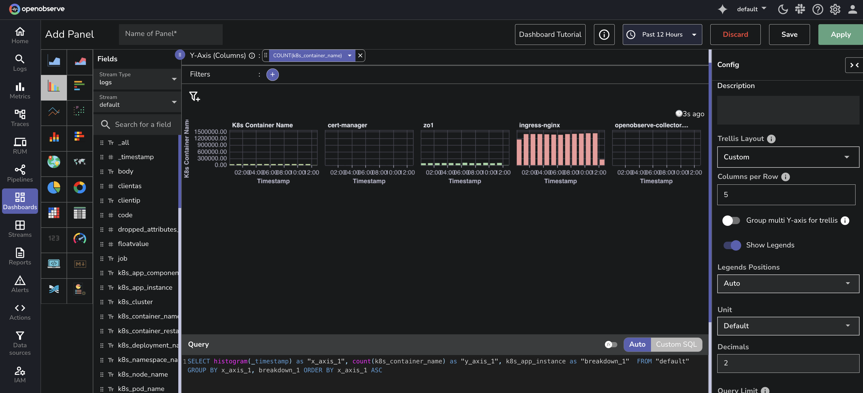
-
Click Apply to view the updated layout.
-
Click Save to preserve the changes.
Multiple Y-axis Grouping
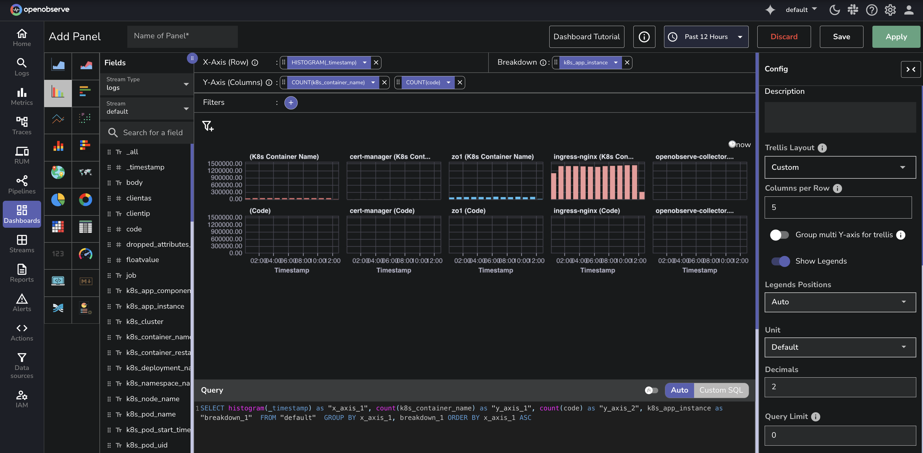
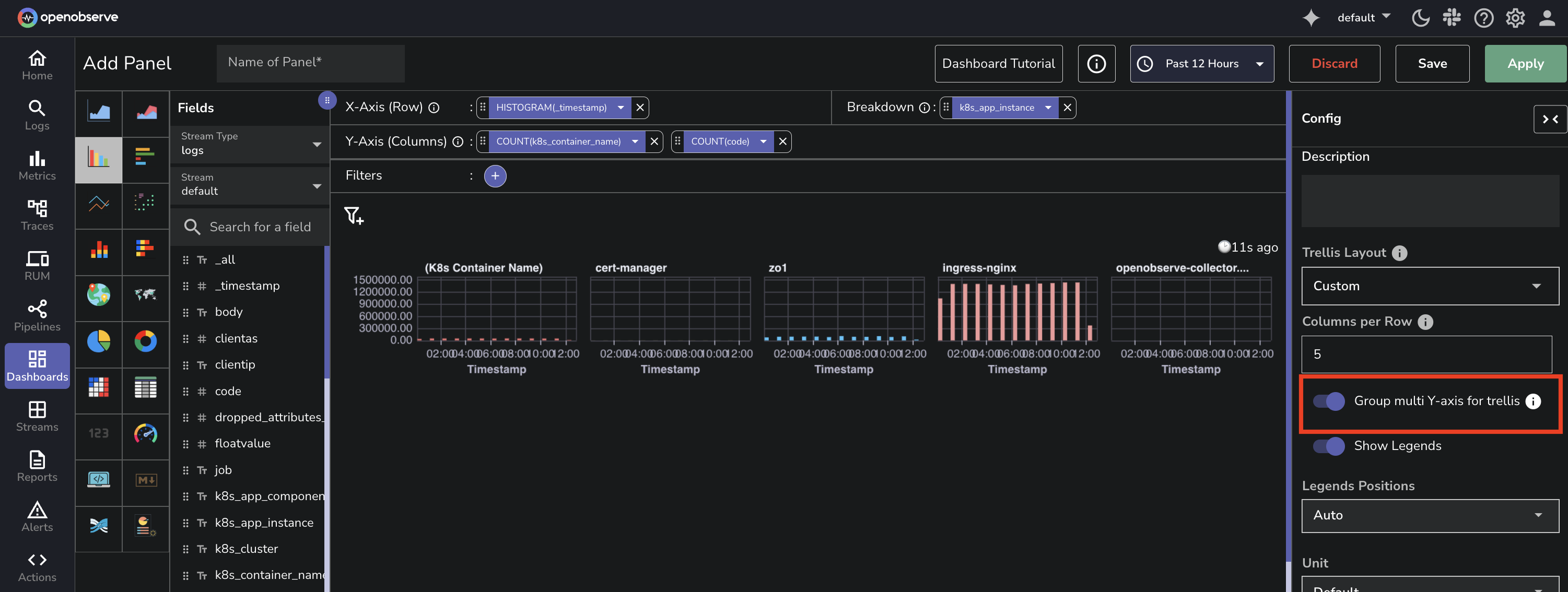
If your panel includes multiple Y-axis fields and a Breakdown field, use the Group multi Y-axis for trellis toggle to control how panels are created:
Disabled: Creates separate panels for each combination of Y-axis field and breakdown value.
 Enabled: Creates one panel per breakdown value, showing multiple Y-axis series in each panel.
Last updated on
Config Overview
The Config tab customizes OpenObserve dashboard panel behavior, layout, and appearance through collapsible sections for legend, data, axis, labels, and more.
Show Symbol
Learn how to configure the Show Symbol option in supported chart types to display or hide data point markers in OpenObserve dashboards.